Bout time I contributed to the phenomenon of Zombies!
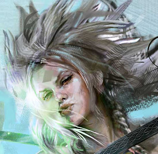
All digital with scanned paint stroke textures. Started with lasso-tool shape silhouette which I progressively worked detail into.
Wednesday, December 5, 2012
Thursday, November 29, 2012
Da Law
'Da Law' is Graphite, chalk and airbrush in toned sketchbook.
Plus some more random Character Development.
Sunday, November 18, 2012
More drawin!
Man I have to say I appreciate having a blog. It gives me an outlet to post sketches and ideas that I wouldn't have normally put on the website.
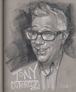
Like this portrait of best bud and uber creative, Tony DiTerlizzi.
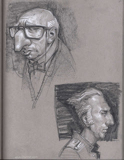
Then there is this fun drawing I did of my buddy Eraklis Petmezas 's character Mr Lune. Such a fun design.
And then finally for the day, I have been a bit obsessed with noses, and in this case the nose knows, you know?
Like this portrait of best bud and uber creative, Tony DiTerlizzi.
Then there is this fun drawing I did of my buddy Eraklis Petmezas 's character Mr Lune. Such a fun design.
Friday, November 9, 2012
Nate Silver drawing
I had-had-had to draw Nate Silver. I love this guy. Like many artists, I was considered a total nerd in middle school, to the point that when it was Girls-chase-Boys Day on the playground, literally one girl stopped me cold and shouted in my face "We're not chasing you dummy." (In reality they were chasing 'Greg' with the feathered hair. Greg, the one cool guy would let me loiter in his shadow. I was just running along for exercise I guess...)
I stink at math so it makes little sense, but after the pundits attacked Nate's blog, I felt this total self vindication on election day- when he nailed it! Like many I had his electoral map open to check every time a state went red or blue. Nate is about as cool as it gets to me.
Anyway, GO NATE!! And Go MATH!
Wednesday, November 7, 2012
Not-so-good guys and ART-rage
Inspired by Wreck It Ralph, I felt like drawing my own characters that could live in a CG animated movie as potential bad guys. If any studios are looking for a guy to draw cool character heads all day, give me a shout. I don't think I wold ever get tired of doing these.
Then I wanted to see if I could get a similar look of graphite and white chalk on toned paper in a virtual program. So launched Art-rage and went to town. It is a great program and should be in every illustrator's toolbox.
Then I wanted to see if I could get a similar look of graphite and white chalk on toned paper in a virtual program. So launched Art-rage and went to town. It is a great program and should be in every illustrator's toolbox.
And finally for this post, here is a little thing. I am doing a novel cover where an object will be the main focus, not a figure, so I used the fantastic (and free) program Alchemy to concept out some cool dagger shapes for the Art Director to choose from. If you haven't used it, Alchemy is a program that lets you design largely with abstracts so you can arrive at very interesting shapes. Most of these were created with 'mirror' turned on so I could design one side of a centerline and it would do the same on the other. It has NO save feature, and no Un-do, so you have to make hard decisions and cross your fingers your next move doesn't mess the whole thing up. I like this aspect of the program a lot actually. (But in the end you can export a file for photoshop to work on top of.) It is amazing if you are a shapist. The AD went with 'F' which was my fave as well.
Sunday, November 4, 2012
Wreck-it Ralph, Self portrait and some doodlin!
Wreck-it Ralph was so great I came home from the theater and draw a pic of him immediately. Even if you don't have kids, if you were kicking it in the 80's you HAVE to see this flick! Bravo to all involved.
Then I guess it was national Self portrait day according to all my FB art friends. I was a day late but did a drawing of myself, (which my wife thinks looks like a combo of me and Greg Manchess. Who is a handsome devil, so I will take that!) I actually did two, first one by looking in a mirror, which sucked in the end, so I drew this one by referencing that one and stylizing it more. My friends say to draw in a cigar and call me Castro. (Note the stache does this, 'happy one side/ sad the other side' thing all the time.
Here is another little head for no reason.
And finally a drawing loosely based on artist friend Bruce Jensen's FB profile pic. But, while a fun drawing in and of itself, I could have done better on the likeness!
That is all for now folks, pick up a pencil and DRAW SOMETHING!
Friday, October 26, 2012
Toned sketchbook- what took me so long?
Artist buddies like Donato have been rocking the toned sketchbook for ages, and I am only now just catching on! Using soft leads (Or ball point), 4B and softer and hitting it with a Generals White Chalk pencil. (Though the Derwent Chinese White works too, only harder to work back over if need be.)
I am trying to embrace the softness more in my sketch work. I am usually so... Karate Chop in my attack. I am enjoying sneaking up on it and petting it rather than bludgeoning it.
I am trying to embrace the softness more in my sketch work. I am usually so... Karate Chop in my attack. I am enjoying sneaking up on it and petting it rather than bludgeoning it.
Wednesday, October 3, 2012
Bunnies that rock
All this serious art from me lately, lets bring back the silly with some Rockin Bunnies. And what the heck, a pooping bunny too!
Friday, September 28, 2012
Izzet Staticater
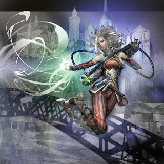
This is Izzet Staticaster, one of 5 pieces from me in the Return to Ravnica MTG set.
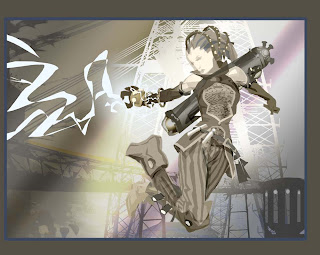
Like the others of this series it had simple origins in what I call a Lasso Tool Shape sketch. So I really didn't draw anything in the usual sense of using line. Rather, I made shapes and filled them with flats and gradients. What this did was let me not get wrapped up in the details too soon. But I was tight on Sketch deadline and threw some random bridge/industrial junk in the background, cause I had no idea what I was going to do with it yet. But it set the mood.
Like the others of this series it had simple origins in what I call a Lasso Tool Shape sketch. So I really didn't draw anything in the usual sense of using line. Rather, I made shapes and filled them with flats and gradients. What this did was let me not get wrapped up in the details too soon. But I was tight on Sketch deadline and threw some random bridge/industrial junk in the background, cause I had no idea what I was going to do with it yet. But it set the mood.
I call this next image a 'midstate', now, but at the time I thought I was just about finished! There were many more hours to go though. After a pretty thorough crit by some trusted peers, I had to dig back in to get it to where you see it at the top. Once again in this version and the final image, the program 'SketchUp' was helpful to get the background. I have always been a reference Frankensteiner, a face from here, a hand from there. I realized with sketchup I could do the same thing. A bit of this building, a tower from here, a flying buttress from there, merged with drawing out of my head to bring it all together. Sketchup won't give you all the answers, but it will give you a heck of a platform. Playing with Sketchup took the backgrounds on these cards further than I ever had before.
And here is a detail shot of the face. Some neat loosey-goosey stuff happened in the painting of it, and I resisted the urge to go in and overwork it. Sometimes you just gotta let the stroke be the stroke.
Wednesday, September 26, 2012
Sketches, drawings and doodles.
Thought I'd share some recent sketchbook action. Whether it is in a sketchbook or loose paper, more and more I realize the voice of an illustrator- that thing that makes them unique, is often strongest in their drawing, rather than in their painting.
A great friend said to me years ago, "Scott you can paint like a M-fer, but your drawings underneath suck, and you try to make up for it in the paint and you can't." Harsh but so true and a watershed moment for me. After that I spent way more time working on the drawing than I do the painting.
But usually I am only drawing for an assignment, and it is only recently I figured out, it is the drawings you do for stuff that isn't an assignment where you see real growth and risk taking. And you cross your fingers some of that adventure can make it back into your professional art w/o the reality of a 'real gig' freezing up your flow. (Which still happens to me all the time.)
Some of these drawings are in a small moleskin, and the others loose. Moleskin drawings are from the local town Fair, trying to capture creatures in the wild. But they moved so fast, I'd sketch a quick essence, and finish them from memory.
Someone asked me about the weird paper the other drawings are on. I love going to flea markets and finding stacks of vintage office supplies, pens and pencils and PAPER. (Anything to get me excited to draw.) This paper came from a sale like that, I have no idea what it was for, but it pretty great. Nice weight, slightly tinted, close to what is in my moleskin, but a little lighter. Rounded corners makes it feel special, lol. I wish I had the binder designed to hold it, alas, I have to keep hunting for that.
Every now and then I take these sketches into the computer and do color study on them and decide if I want to take them further. This is one I might like to actually paint someday. Something about it feels like a happy place between my children's book work and my grown up work.
Friday, September 14, 2012
Counterflux- MTG painting
Here is a fun one that was a bit of a blur to produce. I was working on 5 MTG paintings for Return to Ravnica, which was my biggest contribution to the game in years. But while I was doing these I also had to finish the art for Lottie Paris 2 AND do a massive amount of silhouettes for Jodi Picoult's "Between the Lines".
In the end this meant I had to produce 80+ pieces of art in a span of 2 months. I went into full hobo mode, and somehow came out the other end smelling like roses. (Though my family may disagree with me on that score!)
This is the final image:
And here are three stages of it.
1. Like my other Ravnica pieces, I didn't start with a drawing so much as I built it up with lasso shapes. You can feel the silhouette work I was doing for 'Between the Lines' bleeding into all of my images for this set.
2. I don't love doing perspective, so imagine my joy when I realized I could build the background in Sketch-up and riff on top of it!
3.And here is the painted background using the sketch-up model as a roadmap. At this stage I had not even started the figure beyond the rough silhouette you see in the first sketch.
A final detail of the face, which was an exercise in subtly for me. But the truth of the matter is, I kept painting that eye, and not liking it. So I repeatedly blurred it out to paint it again and again till at one point I thought, "Hey that looks better all smudgy!" And left it as you see it.
Saturday, September 8, 2012
Oil Painting- Not So Soft
This piece has been hopping on and off the easel for too long. So I thought I's share a quick snap shot of it to encourage me to finish it.
Nothing digital here. In the beginning I started the piece as if the Oil paint were water color- almost. But more syrupy, sticky watercolor. Think about pancake syrup. (I dis-like normal liquin, but like Liquin Fine Detail.) This thin translucent underpainting let me spatter turp into it to eat away texture and get some sweet dragging effects with old, frayed brushes.
Then that dried and sat forever collecting dust till I picked up some more opaques and started in again finding a balance between translucent and opaque.
Then I tried something new. Oil based sign painting enamel. (Like pinstripers often use.) Most of the design work is created that way. Oh oh oh, how sweet the solid laydown of paint was. It would take me many coats of normal oil paint to achieve what enamel does in one coat.
The crayon wording and sketchy areas are oil pastel. Which is so great for drawing on an oil painting (That is dry.) and wiping off if you make a bad move or even using trup to melt it into a stroke. I planned on painting lines over the more broken crayon stroke.
But a great friend, Dave Seeley, http://www.daveseeley.com/ is suggesting there might be something cool to leaving some marks almost crayon like. Oooo contrasting textures, I like that thought a lot! Thanks Dave!
Who knows! Painting should be fun, take risks, don't lock yourself in to a preconceived vision all the time or you may miss the piece talking to you. Really it will try to talk to you. Don't be stubborn, open yourself up to the conversation, and give it the opportunity to change your mind.
Here is an earlier detail shot. Darn it, her eyes are not in alignment yet. Thus she is never finished.
Here is an earlier detail shot. Darn it, her eyes are not in alignment yet. Thus she is never finished.
Thursday, September 6, 2012
King of Marbury- cover
This piece was a pleasure to do for Tor.com. Such a great story 'King of Marbury' by Andrew Smith.
Often in my 'grown up' work I do more traditional Sci/fi Fantasy themes. But there is that inner fine artist in me from back in college (SCAD class of '94) that yearns for something more cerebral. The guy who would do paintings inside of suitcases to symbolize 'moving on'. (And then write songs about them and perform them on crit day- but that is another story.)
This was such a well crafted, creepy-cool short story that it filled my head with images. In the beginning I tried to put everything in there including the kitchen sink. But thankfully AD of Awesome Irene Gallo, got me to focus.
Early sketches:
And this is the full piece prior to crop. Because it was for Tor.com, we had a ton of freedom. So I went with a circle.
Monday, September 3, 2012
New Magic Art! Nivix Guildmage
I am pretty psyched to have my largest contribution to Magic the Gathering in years hit the streets of Ravnica. I should have 5 cards in the set (Return to Ravnica), which is the most from me since the Time Spiral series.
Simply put, the MTG fans are about the best fans any artist could ask for. So it is a pleasure to have new artwork in that world. Tap away my friends.
The piece is 100% digital.
The finish was a blast to do, but I set a really interesting challenge in creating the work, and that was, I never did a 'drawing'. I started with shape. A lot of my digital technique comes from using the lasso tool on Photoshop to create shapes which I fill with flats and gradients. Even some of the finished areas are tiny little lasso shapes that are lightened and darkened.
The point of this is that the simplicity of shape lets me not get caught up in the details too early, cause that can be a prison. This let me focus on energy and mood and composition, and the detail becomes the frosting on a pretty solid cake.
What you see below is the actual 'sketch' I sent for approval. Art director Jeremy Jarvis had to strap on his trust helmet that the details would emerge out of the simplicity. And he did. But I think that trust comes from years of working together.
Sunday, September 2, 2012
Sketch book action- Brush Pen
Takin' a breather from all the ball point drawing and grabbed one of those super sweet Japanese Brush pens! I'd tell you the name, but it is top secret! Actually, I don't know the name. I just stumbled on it walking around Pearl paint one day. And there is almost ZERO English on it, so I am not sure what it is called. But I will sure need to know when it is time to buy refills!
LOVE love love this pen. The line gets so darn thin, then wham you are into the thick. My only wish was that it was waterproof, alas, prolly wouldn't be so smooth if it was.
Also did this little 'goodbye to summer' illo with it. Tried something I've been itching to do. After I sealed this ink drawing with Crystal Clear, I did oil-paint washes on top of it. I think there is something here. Must do more!
And here is the pen itself so you can hunt one down! That's all for now folks!
Monday, August 20, 2012
Showing Juno- the whale, my sketchbook
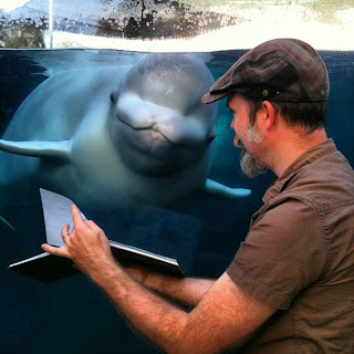
The other day we took a spontaneous family day-cation to the fantastic Mystic Aquarium in CT. Naturally, I brought my sketchbook with me to draw some of the super-cool critters swimming about. For the fun of it I showed the penguins a drawing I had done of them, which they looked at for about a second and swam on. (Not big art fans.) But later that day I found the biggest (physically) art fan I have ever met in Juno the Beluga Whale. I showed him my sketchbook.
What happened next is a moment I will never forget. Juno studied and observed the sketchbook with me for a hour! He would turn his head with the page flip, focus on the things I was pointing too. He wanted little to do with anyone or anything else but the book. Woah. To say it was a bonding moment is an understatement. (Or maybe it was just my moustache?)
Thankfully, pal and kids book dude Tony DiTerlizzi and his fam were with us on the family day-cation and he shot some video of the moment. To our surprise, I guess it has received a few hits on you-tube! You can see the video here:
Scott Fischer and Juno bonding http://www.youtube.com/watch?v=KQNDwZ2gJuI
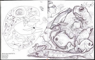
Everyone keeps asking what Juno was looking at in the sketchbook. My sketchbook is a chaotic catch-all for the stuff that falls out of my brain- from Children's book ideas (Yup there is a whale one brewing.) to a visual daily diary. So Juno was soaking in a lot of info! I am working of a drawing of him that is not finished, but here is one page he was looking at. These were drawings I was doing at Mystic that day. (More sketchbook entries can bee seen in earlier entries of the blog.)
Guest sketchers, Sarah (Age 9) and Sophia (Age 5) helped me out on this page.
Subscribe to:
Comments (Atom)


