I did an interview with the lovely Wendy
Martin. We talk about inspiration, technique, and Kraft Macaroni and
Cheese. (OK we didn't really talk about that. But it is yummy.) Thanks
for making me look good Wendy!
Scott Fischer Interview w/ Wendy Martin
Wednesday, March 20, 2013
Friday, March 8, 2013
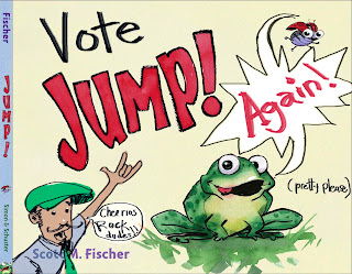
Vote for JUMP! 2013
Can I be so lucky as to have one of my books be a prize in Cheerios boxes for a second time? Yes! With your help. Cheerios has selected 5 books (that have all been in Cheerios boxes before) and one of the five will leap back into boxes of crunchy goodness in 2014! You can help get 'JUMP!' back in the box with two clicks. BUT even cooler. The folks at Cheerios and First Book will donate one book to a child in need for the first 25000 votes! That is awesometastic!
Even if you don't vote for 'JUMP!' please vote to get a cool book into the hands of a cool kid somewhere! Voting ends March 11 2013 that is like in two days! So vote here, quick!
Vote for JUMP!
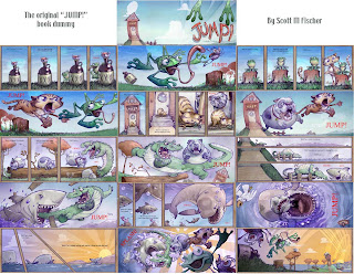
And in celebration, I thought I would share the ORIGINAL book dummy for 'Jump!'. If you know the published version, yo can see how major the evolution was. Third graders prefer this version 10 to 1, but the book was really for toddlers, and most of them prefer the printed version. Cause, you know, sharks are scary (Unless you give them one tooth. That is the secret!)
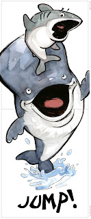
Here are a couple spreads from the printed version!
Friday, January 11, 2013
Ballpoint Baller- technique
I had a question about my transfer process before I do a final ballpoint drawing. Now, if I am working in my sketchbook, I just wing it with no predrawing, but that is easy when there isn't a description I have to follow!
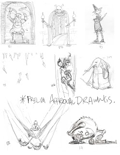
But when you are on a gig, there is an approval process. And you don't want to kill yourself on a drawing that may get killed in the end, so you send a prelim.
So I do a quick thumbnail, which is usually a pencil or pen scribble in the margin of a manuscript. I scan that into the computer and use the stylus and photoshop to clean it up. I will attach a page of what these drawings look like, be warned, they aren't pretty!!
After approval I make any changes in P-shop based on feedback. I tighten some things in the computer, but it is usually pretty messy still. I want to leave some fun for the actual ballpoint so I don't spell it all out.
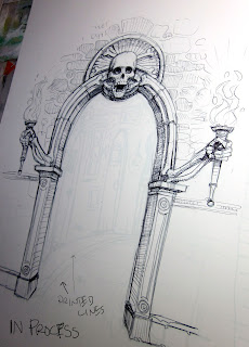
When I am ready to do the final, I first tint the drawing to the CYAN with 'image/ adjust/ hue/saturation'. Then I go into 'Image/ Adjust/ Levels' and use the slider on the bottom of the window by grabbing the 'dark' side slider and sliding it all the way up to about 252. It will look like the drawing is gone, but it is still there, just very light.
I then print it out with my Epson on Strathmore 2ply bristol 500 plate surface. It is hard to see the printed drawing, but if you did it right, you will see just enough to get the ballpoint flying.
In the attached Archway of doom you can still see the cyan printout I am working over inside the entrance.
Thursday, January 10, 2013
Blazing into 2013
I am slack on my blog posts, but rest assured I am pumping out the art to kick off 2013! These are about 1/3 of the drawings for Scary School book 3 by Derek Taylor Kent. Due to hit the shelf this summer, so I better keep the ball point pen moving!
Wednesday, December 5, 2012
Zombie ATTACK!
Bout time I contributed to the phenomenon of Zombies!
All digital with scanned paint stroke textures. Started with lasso-tool shape silhouette which I progressively worked detail into.
All digital with scanned paint stroke textures. Started with lasso-tool shape silhouette which I progressively worked detail into.
Thursday, November 29, 2012
Da Law
'Da Law' is Graphite, chalk and airbrush in toned sketchbook.
Plus some more random Character Development.
Sunday, November 18, 2012
More drawin!
Man I have to say I appreciate having a blog. It gives me an outlet to post sketches and ideas that I wouldn't have normally put on the website.
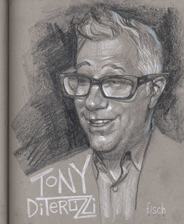
Like this portrait of best bud and uber creative, Tony DiTerlizzi.
Then there is this fun drawing I did of my buddy Eraklis Petmezas 's character Mr Lune. Such a fun design.
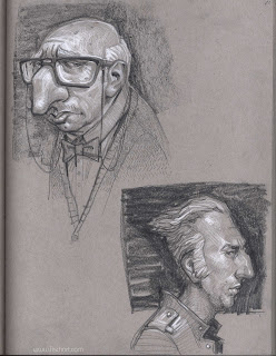
And then finally for the day, I have been a bit obsessed with noses, and in this case the nose knows, you know?
Like this portrait of best bud and uber creative, Tony DiTerlizzi.
Then there is this fun drawing I did of my buddy Eraklis Petmezas 's character Mr Lune. Such a fun design.
Subscribe to:
Comments (Atom)


